In this project, we are asked to discuss the impact of commodity factors on US equity sector allocation. Specifically, how to use commodity index and other factors such as the US ISM Manufacturing PM, US Dollar Index to help us build a portfolio performing better than the benchmark index, S&P 500.
There are primarily four goals for this project:
Investigate the relationship between each factor candidate and how each factor would impact the sector return.
Use the commodity index and other related factors to build regression models to forecast returns of all the sectors included in the S&P 500. Then, based on the predicted return, we adjusted the weight for these sectors and construct several portfolios seeking to provide returns that can outperform the benchmark index.
Explore non-traditional machine learning technique, specifically decision tree model to forecast sector returns and discuss the effectiveness and efficiency of incorporating machine learning techniques in our analysis.
Use a set of criteria for each strategy specification and backtest our results. Make decisions about the optimal investment strategy and discuss the potential limitations in our research and future study direction.
Part II: Data Description and Preprocessing
We downloaded S&P 500 sectors historical monthly data from Yahoo Finance, from 1995-01 to 2022-04. Among which, the real estate sector only began from 2002-11-02. To keep as much data as possible and to simplify the research process, we downloaded the US REIT index from Nareit to fill all the null values in the real estate sector.
Then we downloaded the monthly US Dollar index(DXY) and Bloomberg Commodity index(BCOM) from Factset. Finally, from Bloomberg, we downloaded the Consumer Price Index(CPI) and Purchasing Managers Index(PMI). When merging the five single datasets, we lagged CPI for one month considering the fact that we may not acquire such data by the time other indexes are published.
Also, we adjusted S&P 500 sector data, which is recorded at the beginning of each year, to the appropriate date index.
After having all raw data prepared, we calculated monthly percentage change for all indexes for our following analysis. Table 1 below shows the full merged dataset.
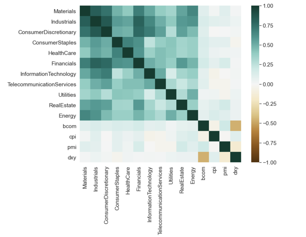
We first created a matrix for the correlation between each pair of variables across the whole time period. With the complete dataframe, we could actually find the different correlations between the variables such as the sector returns, the precentage change of PMI index,
CPI index, BCOM index and DXY index. The correlations are shown in the following heatmap. From the results shown below, we can see that:
Across the entire time period, nonen of the factors alone seems to have a strong correlation with the S&P 500 sectors
The relationship between commodity index and the eleven sectors varies from 0.00 to 0.25, indicating a weak positive relationship.
There seems to be a relatively strong negative relationship between commodity index and US dollar index
Given the three findings listed above, we believe in order to make better use of the factors we were given to help us predicting sector return and further adjusting sector weights, we should start our following analysis from two aspects.
First, adjusting the constant testing period to a rolling one and see whether we can observe a more applicable correlation which can help us making predictions. Second, including the interations among the four factors when constructing our prediction model.
Figure 1: Full Sample Correlation Heatmap
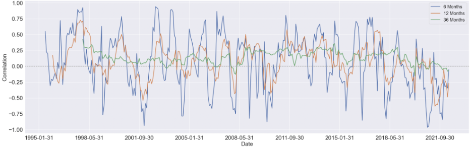
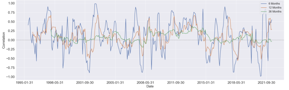
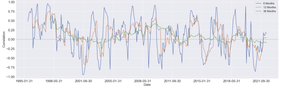
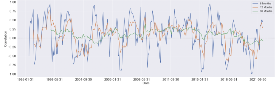
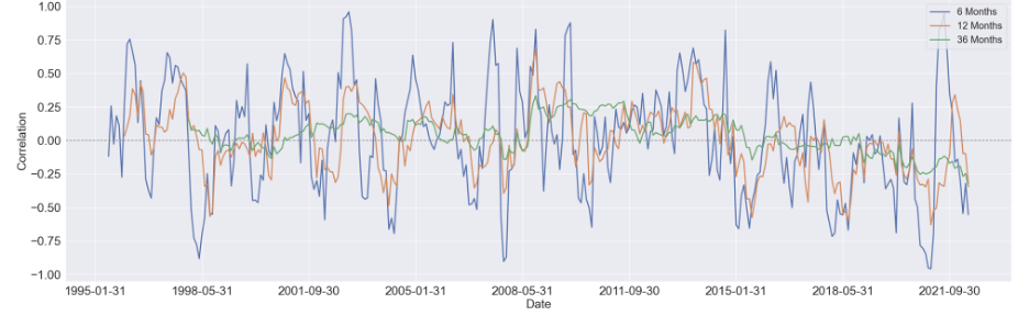
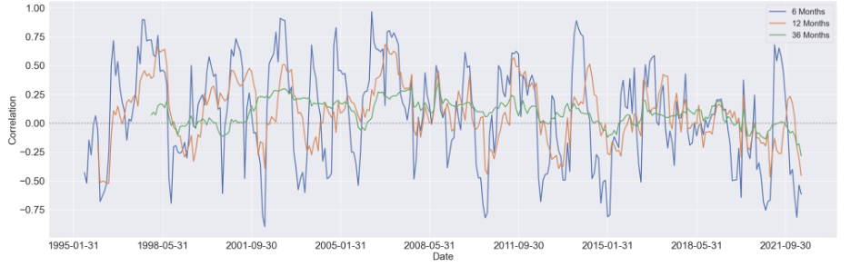
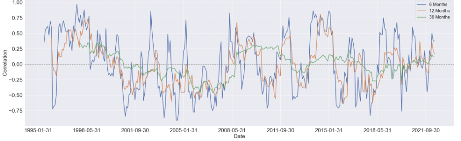
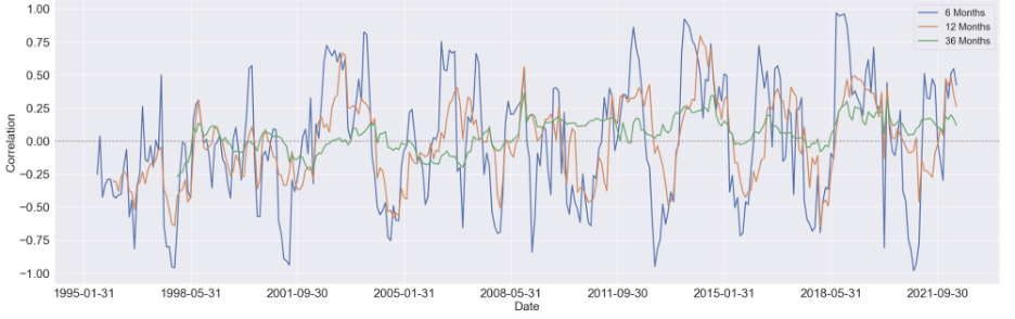
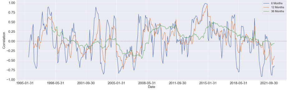
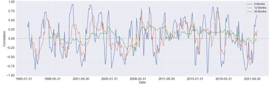
3.2 Rolling Correlation
We started by estimating the rolling correlation between each pair of the variables using three window sizes, which are 6-month, 12-month, and 36-months. Generally speaking, as the window size increases, the magnitude of the correlations diminishes, but the patterns didn't change too much.
We first focus on visualizing the 36-month correlation between BCOM and S&P 500 eleven sectors since commodity index is our primary variable of interest, and setting the window size to 36 will eliminate most of the noise in the data, which can give us a much clear pattern to study.
Here are some findings we summarized from the 36-month rolling correlation:
For the majority of time, the Financial sector and industrial sector are positively correlated with BCOM
The relationship between consumer discretionary sector and BCOM stays constant around zero, other then a obvious positive period around 2008 to 2015
For consumer staple sector and utility sector, there's a U shape in the their respective correlation between 1998 and 2008, while after 2011, the relationship diminishes notably
There's seem to have a mild upward trend in the correlation between Real Estate sector and BCOM. And before 2008, this relationship is mostly negative, while after 2008, it shifts towards positive
Similar to Real Estate sector, the correlation Energy sector and BCOM turns to mostly positive after 2008, however, without an overall long-term trend shown in the figure
After conducting the correlational analysis, we started to build predictive models to forecast the sector returns, and using the results to construct monthly portfolio.
To begin with, we used the simple regression equation to predict sector returns using the four indexes we have. To avoid looking forward bias, we lagged all the independent indexes before fitting our model.
Following are a few problems regarding the model setting we have considered and discussed throughout our analysis.
1. Univariate and Multivariate Regression
Since our primary objective is to study how the commodity index might help us in equity allocation, we suppose it's a good idea to build a univariate regression model first to study the relationship between commodity index with each sector,
which can give some indication as to which sector is more sensitive to the change of commodity price.
The results of the rolling correlation seem to tell us that the magnitude of correlation between sector returns and the percentage change in the indexes diminishes.
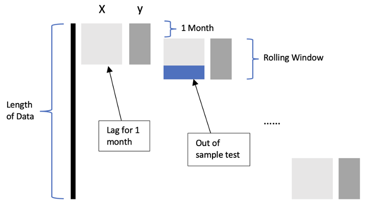
As a result, we are curious about adopting the method of rolling regression and testing whether it can improve the fixed regression predicting accuracy. For the purpose of comparison,
we first divide the data into training samples and testing samples. Using the first two-thirds training data to estimate the coefficient and making predictions on the entire dataset.
Considering the rolling regression, we assume both 6 months and 12 months seem like a reasonable prediction period, so we decided to study both periods and compare the forecasting accuracy.
Figure 3 depicts the function we constructed for rolling regression, we take the first 6 months or 12 months to be our rolling window, and the lag one month to be our out of sample date to test it.
And we continue to roll the data until we reach the end of the data. Compared with the static method, the rolling one only uses the newest information to do the regression, which we hope can have a more profound impact on the sectors' returns.
Figure 3: Moving Forward Regression3. PCA for dimension reduction
One problem with the rolling method is that each time we only have six or twelve data as training samples, compared with the number of factors, the extremely small sample size could possibly render the regression model useless,
especially if we want to add more interaction variables to the equation. So, now we are considering using PCA to reduce the dimensionality for our independent variables. When applying PCA to the dataset,
we created a function to find the number of components that can explain a certain threshold of variance in our data. In our case, we set the threshold to be 85%.
4.2 Weighting Scheme
Our goal is to get the return of each sector, and then use the predicted returns to adjust the weights of different sectors. Specifically, we created a list of evenly spaced weights ranging from -1/n to 1/n, where n is the number of sectors in each month.
Based on the ranking of the predicted sector return, we readjust the order of this list. Then we made adjustments based on the original S&P 500 weight to construct our portfolio, giving the higher ranking the higher weights. After we get the adjusted weights,
we multiply it by the actual return to get the adjusted portfolio returns, and then compare it with our benchmark, SP 500.
4.3 Method Comparison
1. Fixed Regression
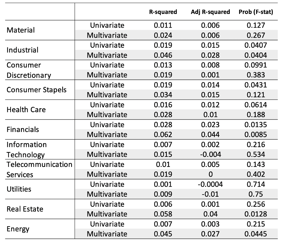
As shown in Table 2, the R-squared of 11 sectors increases a lot after adding the independent variables. When it comes to the Adj R-squared, we found that the situation is very different in each sector. For almost half of the sectors,
adding can help it improve the fitting ability. Combined with the adj R-squared and the realistic situation, we assume that all the indexes should play a role in the change of returns of different sectors. So in the following analysis,
we will mainly focus on the situation of multivariate regression. At the same time, we will bring it to mind when doing the rolling regression to see whether we will find a reasonable explanation for this situation.
Table 2: Fixed Regression Result Comparison
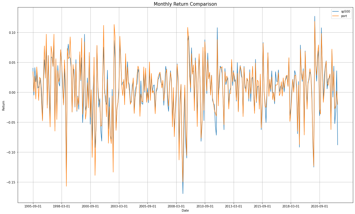
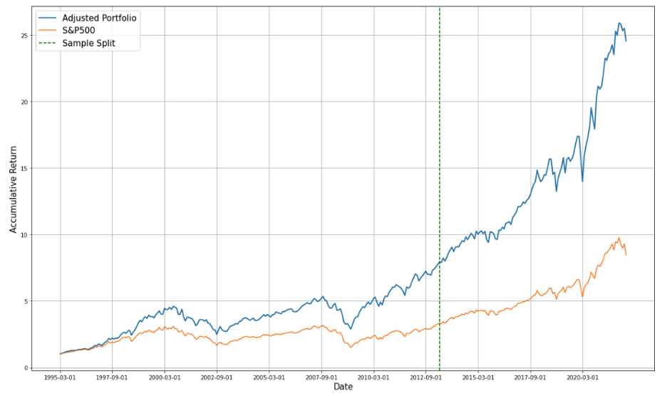
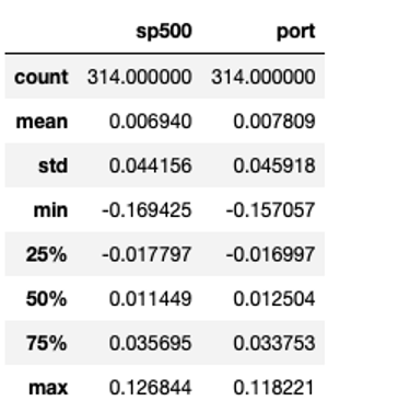
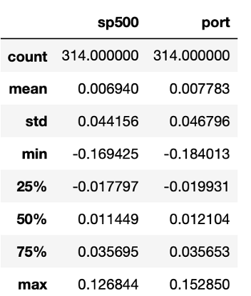
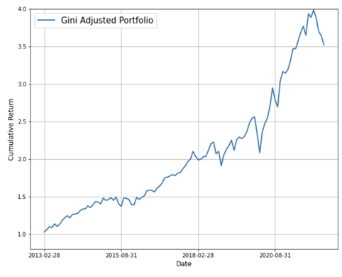
From the following table, we can see that adjusted weights have helped us increase the mean, but not efficiently decrease the volatility. For the cumulative return, our portfolio has an obvious advantage over our benchmark portfolio.
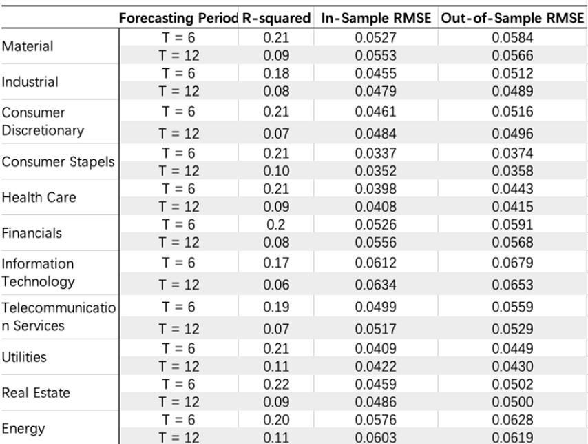
From table 4 we can see that the R-squared improves when the rolling window decreases from 12 month to 6 month, while the RMSE stays consistent.
Multivariate Regression
Table5: Multivariate Regression comparison
This table also indicates that the shorter time period's R-squared is bigger than these of the 12-month. From the perspective of R-squared, we decide to use 6 month as our rolling window when we add the pca into our regression.
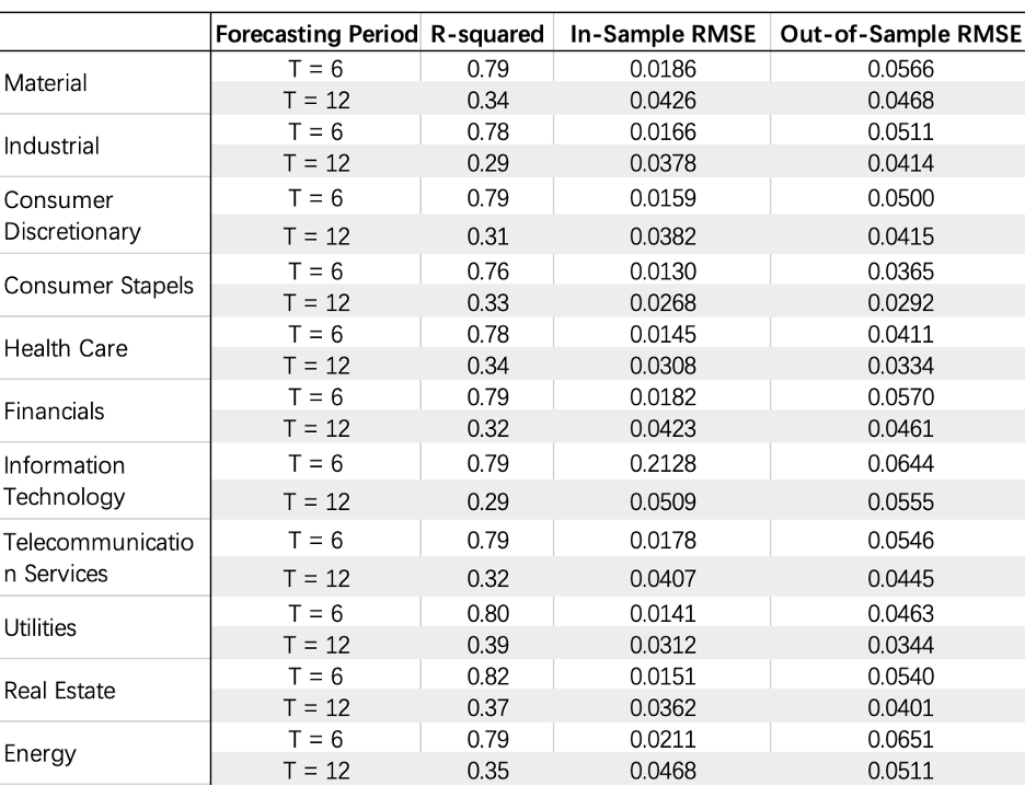
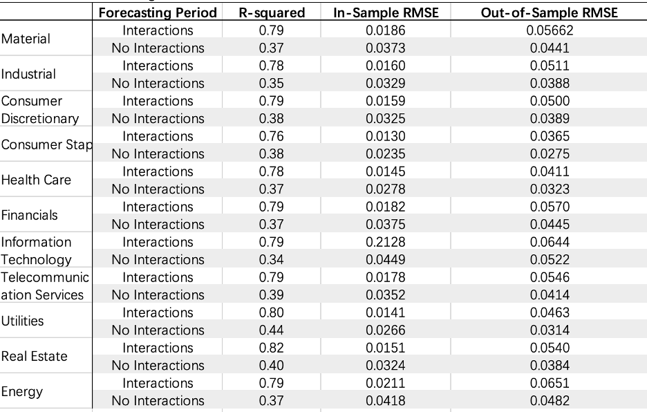
Table6: Multivariate Regression comparison with interactions
The regression with the interactions has worse fitting, even though we have added one another independent variable into the regression, the R-squared decreases.
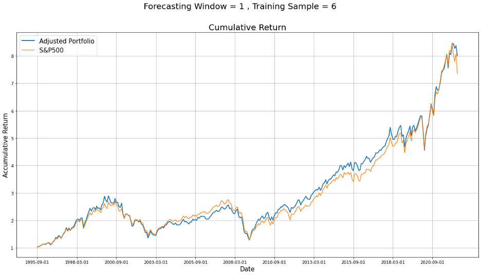
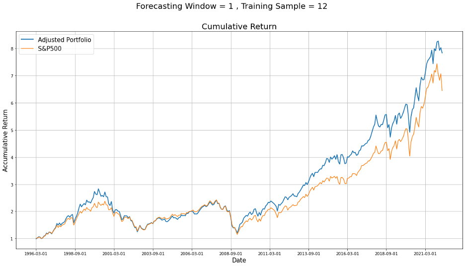
Table 8: Multivariate Rolling Regression Portfolio Statistics(T=12)Figure 6: Multivariate Rolling Regression Portfolio Comparison
Table 9: Rolling Comparison
Benchmark
t=6
t=12
Excess return
0.0002387
0.000786
Tracking error
0.058
0.011
Average IR
0.0712
0.423
Average Sharpe Ratio
0.11
0.126
Hit Rate
0.5127
0.493
MDD
-4.5633
-4.2355
-5.217
Comparing Figure 5 with Figure 6, we can see that even if T=6 has a bigger R-squared, the cumulative return doesn't beat the return when rolling window is equal to 12.
Also the comparison of financial statistics can not tell us that the shorter rolling window has the advantage of predicting the return hence help us to adjust the weights.
We have consulted relevant statistical data, which shows that R-squared will be affected by the amount of data. When the data pool is small, it may not be very stable.
Therefore, the R-squared of 6 months is better than that of 12 months, probably because the number of samples in the calculation increases in the 12 months, leading to the decline of R2.
And due to the limitation of the data sample when doing the rolling regression, we cannot draw a conclusion that the rolling regression with higher R2 is better than fixed regression.
After comparing those cumulative returns, we think that 6/12 did not improve portfolio performance due to unfair comparison.
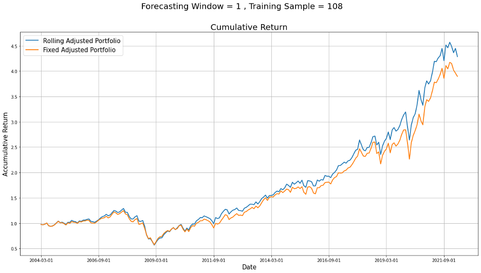
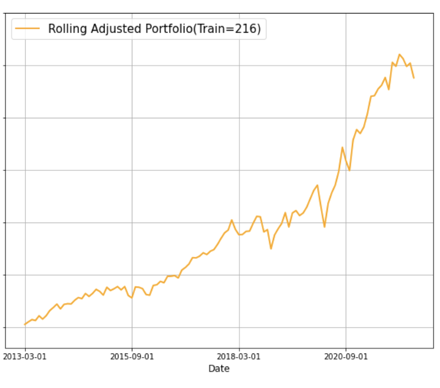
In order to see whether the rolling method could help us improve the portfolio, we decided to set both the training date and the rolling window to be the same,
which is the first one/two thirds of our data and then compare their cumulative return to see if there is an improvement.
Figure 7: Rolling with Longer Training Period
3. Conclusion
Don't trust R2 when the training sample is limited, especially when you need to compare two methods that the number of data using to calculate the R2 varies widely.
Rolling can improve, it may be due to that rolling can help us to put the newest information, hence the data into regression, which has the greatest impact on the capital market, and different sectors will react to the latest news in the market.
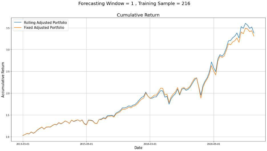
Pick the best one for regression analysis-Rolling and training data =216
And the adjusted weights for the 11 sectors of the last out of sample is
[-0.014, 0.13 , 0.098, 0.012, 0.153, 0.155, 0.211, 0.006, 0.026, 0.096, 0.127]
Part V: Decision Trees
In this section, we tested the use of a non-traditional algorithm, Decision Tree Model, for active equity allocation, and compared the result from Decision Tree model to that from the traditional method.
Using the decision tree model, we can set up a classification system to predict the future outcome for all the sectors included in S&P 500 based on a set of decision rules constructed by the independent indicators we choose to use.
5.1 Model Settings
1. Classification vs. Regression Tree
In our case, one problem of using machine learning methods is insufficient data. Given that we only have a total of 327 monthly data, it is likely that our model memorizes the pattern of the data instead of learning intrinsic characteristics hidden behind,
which leads to high accuracy in the training set and poor performance in the testing dataset. To reduce overfitting as much as we can, we decide to use the sign instead of the absolute value for both independent and dependent variables and build a classification tree model.
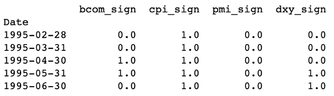
For the four independent factors we have, we first calculated the monthly percentage change, then if the change is positive, we would encode it as one, otherwise as zero.
Table 10: Independent Indicators
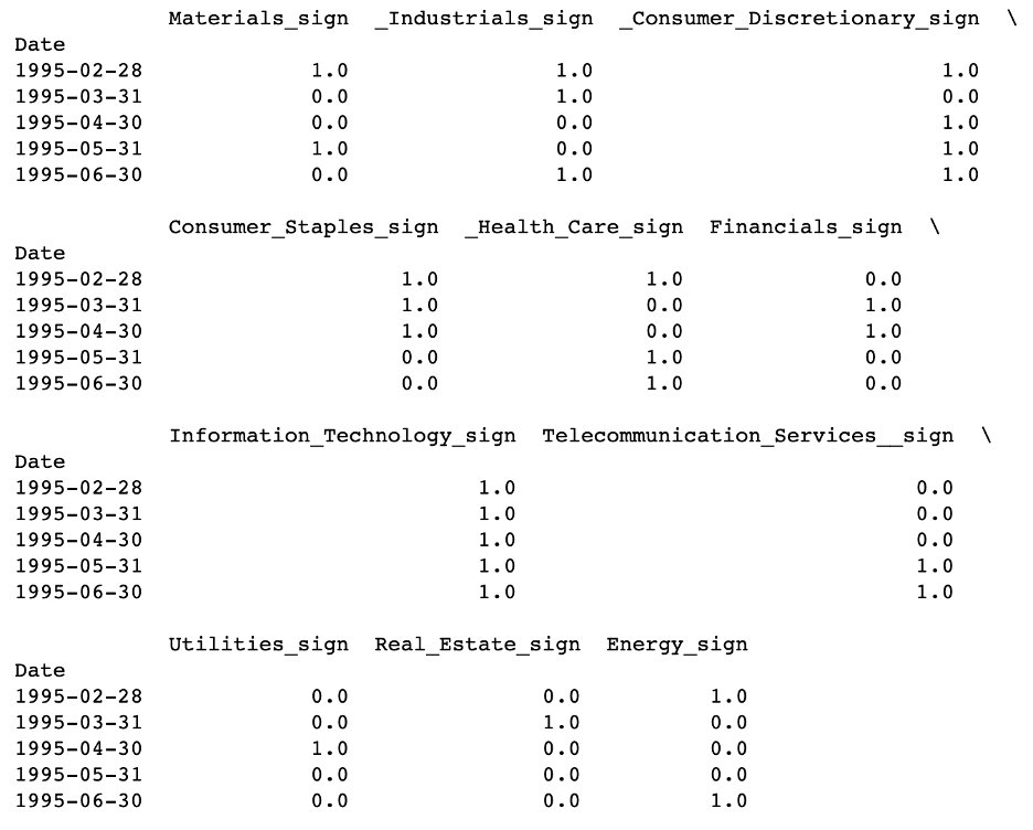
For the eleven sectors, we calculated the sector return as we did when using the traditional regression, then we compare that with the return of S&P 500, if the sector outperforms S&P 500, we encode it as one, otherwise as zero.
Table 11: Target Sectors2. Rolling vs. Fixed Model
In this section, we focus on building a constant decision tree model as opposed to the walking forward prediction method. More specifically, we divide our data into two sections: the training set(in-sample) contains the first
two-thirds of the data ranging from 1995-02-28 to 2013-03-31, and the testing set(out-of-sample) is made up of the rest one-third of data ranging from 2013-04-30 to 2022-03-31.
Then, we used the training dataset to find the decision rules and make predictions for both in-sample and out-of-sample data.
There are two reasons behind our choice. First, as mentioned above, we are trying to avoid overfitting in our analysis, and increasing the training sample size will be helpful.
Second, dynamic modeling means that each month we need to reconstruct the decision tree and decision rules are varying constantly. It can be difficult to provide a solid explanation to back up our mathematical result. Moreover, it's less applicable to draw conclusions from the monthly-shifting models.
3. Splitting Algorithm
When choosing the splitting algorithm, we choose to use the absolute excess return to estimate the gini impurity. At each splitting node, we iterate through the four classifiers and based on the sign of each classifier dividing each sector into two sets of returns. After that, for each set, we use the following formula to find the weighted gini value of the 11 sectors.
$$ {Gini = 1 - (\frac{P}{P+N})^2 + (\frac{N}{P+N})^2 } \quad[3]$$
P is the absolute value of the sum of positive excess returns
N is the absolute value of the sum of negative excess returns
After we have the gini index for each sector for both sets of return, we can have the gini index for each of the possible splitting classifiers using the equation below. Then we can choose the classifier that gives us the lowest overall gini value at each splitting point.
$$ {Overall Gini = 1 - \frac{1}{11}\sum_{i=1}^{11}\frac{A}{A+B}Gini_{above} + \frac{B}{A+B}Gini_{below} } \quad[4]$$
A is the absolute value of the sum of excess returns in set1
B is the absolute value of the sum of excess returns in set2
As what we did in section 4, here we still use the original weights for all the sectors in S&P 500 to be the base weights and adjust accordingly.
From our classification tree model, we can obtain two different pieces of information. One is the predicted signal which suggests whether this sector will outperform or underperform S&P 500,
another is the gini index associated with each sector, indicating how accurate this prediction is. Given the information we have, we designed two weighting strategies to construct our portfolio.
First, we simply use the predicted signal to adjust sector weights. For all the sectors predicted to outperform the S&P 500, we will increase their weights by a same amount, calculated using equation below.
Similarly, for the sectors predicted to be the underperforming sectors, we would subtract a number from the base weight.
Then, we want to include the other output we have in adjusting the weight of each sector. In this case, instead of giving the same lift to all the outperforming sectors and the same downgrade to all the underperforming sectors, we readjust the weights using the gini index.
Within each group, we would give the sectors with smaller gini index a higher weight and give lower weight to sectors having relatively larger gini index. To make the two strategies comparable, we also made sure that the two sets of adjusted weights have the same mean.
2. Portfolio Comparison
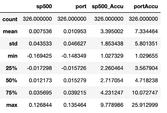
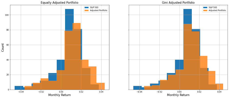
From the histogram and the summary statistical table below, we can see that both portfolios we constructed perform better than S&P 500 in terms of both return and standard deviation. And the second portfolio we built using the gini index performs slightly better than the first one.
However, we also noticed that for both of the portfolios, the out-of-sample result outruns its in-sample counterpart.
Figure 8: Histogram of Monthly Return Comparison
Table 12: Monthly Return Comparison
Full Sample
In-Sample
Out-of-Sample
S&P 500
Port1
Port2
S&P 500
Port1
Port2
S&P 500
Port1
Port2
Mean
0.0075
0.0108
0.0112
0.0064
0.0104
0.0108
0.009
0.0115
0.0119
Standard Deviation
0.0435
0.0469
0.0469
0.0451
0.0501
0.0500
0.040
0.0398
0.0400
Min
-0.1694
-0.1734
-0.1683
-0.1694
-0.1734
-0.1683
-0.1251
-0.1134
-0.1089
Max
0.1268
0.1377
0.1400
0.1077
0.1377
0.1400
0.1268
0.1335
0.1346
Moreover, we used the following measurements listed in Table# to compare the portfolio performance for the entire time period, and for the training and testing period respectively.
Across the entire time period, the second portfolio we built has a higher Excess Return, Information Ratio and Sharpe Ratio compared with the first one.
And a smaller Maximum Drawdown indicates the second portfolio can better manage risk than the first one. The tracking error for the second portfolio is somewhat higher,
however since the tracking error only measures how much our portfolio deviates from the benchmark, this does not necessarily equal riskier investment.
Then we made comparisons horizontally, between the in-sample period and the out-of-sample period. The results tell a similar story, the second portfolio still outran the first one, while in the out-of-sample data,
the excess return for both portfolios have a much smaller magnitude. In addition, we noticed that the Information Ratio for both portfolios have become smaller, while the Sharpe Ratio shows an opposite change.
This seems counterintuitive since both ratios measure the risk adjusted return for a given security. One possible explanation we could come up with is that the performance of our benchmark, S&P 500, also changes in terms of both average return and index volatility.
Because Information Ratio measures the risk-adjusted return relative to the benchmark, while Sharpe Ratio compares to the constant risk-free rate, this difference might be responsible for the results we have here.
Table 13: Portfolio Comparison
Annual Measures
Full Sample
In-Sample
Out-of-Sample
S&P 500
Port1
Port2
S&P 500
Port1
Port2
S&P 500
Port1
Port2
Excess Return
0.0033
0.0037
0.0041
0.0045
0.0019
0.0023
Tracking Error
0.0098
0.0100
0.0117
0.0115
0.0061
0.0070
Information Ratio
0.3650
0.3808
0.3861
0.3999
0.3288
0.3559
Information Coefficient
0.1006
0.1058
0.0920
0.0913
0.1027
0.1263
Sharpe Ratio
0.2057
0.2158
0.1621
0.1703
0.2577
0.2735
Hit Rate
0.6288
0.6134
0.6376
0.6284
0.6111
0.5833
Maximum Drawdown(%)
-456.3
-460.9
-431.7
-456.3
-460.9
-431.7
-281.5
-266.7
-279.6
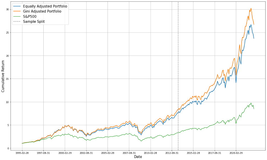
Following is cumulative return for the two adjusted portfolios and for the S&P 500. At the end of the testing period, our second portfolio has outperformed the equally adjusted one, and has tripled the cumulative wealth of S&P 500.
Figure 9: Cumulative Return Comparison
Table 14: Next Month Weights Prediction (2022-04-31)
Material
Industrial
Consumer Discretionary
Consumer Staples
Health Care
Financial
-0.0191
0.1770
0.1252
0.0658
0.1177
0.1527
IT
Telecom
Utility
Real Estate
Energy
0.2865
0.0317
-0.0074
-0.0308
0.1006
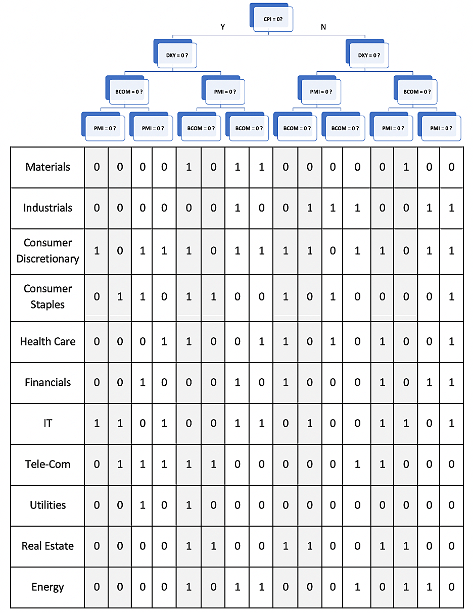
5.3 Tree structure and Findings
After we constructed our portfolio, we studied the structure of the classification tree and decision rules coming with it.
1. Factors Ranking
As we can see from the figure below, the Consumer Price Index(CPI) is the root node, indicating that for the training data we have, CPI to be the leading classifier compared with the other three in predicting sector returns.
CPI keeps track of the average change in the prices paid by urban consumers for a market basket of consumer goods and services over time, and it's also used as a tool to monitor inflation by the Central Bank and the government.
In our study, we used the monthly percentage of CPI to be the indicator and make predictions. If the change is positive, it indicates an increase in the price of consumer goods and services, in other words, there's a trend of inflation.
And if the change is negative, it reflects a relatively healthier economic condition.
As we studied the eleven sectors included in S&P 500, we have found that seven out of the eleven sectors, including Technology, Financials, Energy, Materials, Consumer Discretionary, and Industrials, can be viewed as the cyclical sectors,
meaning they are sensitive to the economic movements. Except for the seven sectors above, the Communications sector in recent years have become more sensitive to economies as well due to the impact coming from the prevailing streaming services.
We assume that this might help explain why CPI plays such a crucial role in making predictions.
Figure 10: Tree Structure and Decision Rules
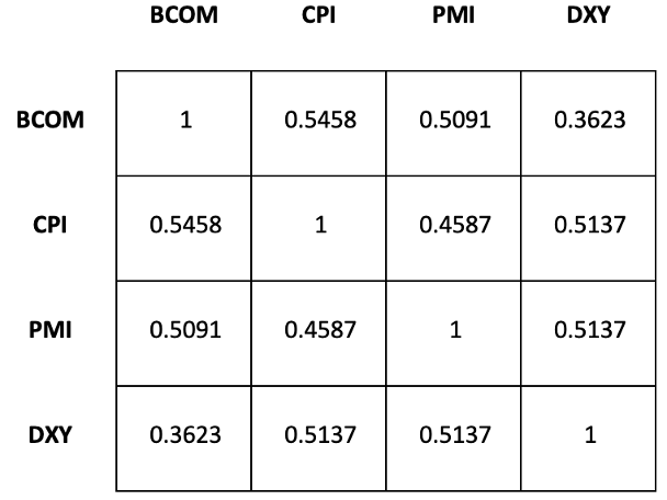
Although the above discussion might provide some explanation why CPI serves as the leading classifier, there's another potential bias we'd like to point out that is caused by multicollinearity in our model. Because we are dealing with time series binary data,
instead of using the spearman correlation, we chose to compare two variables directly and find how many times they move in the same direction over the whole training period. As shown in the Table 14 below, for each two pairs of variables, there's about half of the time they are moving in the same direction at a given month.
By its nature, the predictions from decision trees are immune to the problem of multicollinearity. Because as a non-parametric model, it makes no assumptions on the relationship between independent variables, each time when splitting, the model will only choose one feature and classify on that particular feature. However,
studies have shown that when it comes to feature importance and interpretation, multicollinearity can cause a problem. A high correlation will offset the importance of that feature and thus make the feature ranking susceptible.
Table 15: Correlation between classifiers2. Additional Findings
In addition to the feature ranking, we also studied the predicting result to help us get a better grasp of the decision rules.
Three of the most noticeable rules we identified:
When DXY = 0, the Materials sector always underperforms the benchmark.
In our model, DXY = 0 means that the percentage change of the dollar index is negative, that is to say the value of the US dollar is decreasing. In other words, the Materials sector is less profitable when there is depreciation. Regardless of the cause of the depreciation,
we believe it will lead to unfavorable import prices for the domestic companies and we suspect that this might be responsible for the Materials sector's underperformance.
Within the Materials sector, there are five major industries, including Chemicals, Construction Materials, Containers and Packaging, Metals and Mining, and Paper and Forest Products. And among the five industries, Chemicals has always been the largest one, from about 50% in the 90s to 70% in recent years.
Companies belonging to this industry will convert raw materials into industrial chemicals. Since half of the raw materials in the US are imported, when dollars depreciate, it will increase the production cost thus will hurt profit.
When CPI = 1 or PMI = 1, the Utilities Sector is always predicted to underperform S&P 500
CPI keeps track of the change in the price paid by customers for consumer goods and services and can be used to measure inflationary level. In our model, when the price is rising, we would set the index as one. So in this case, we know according to the decision rules that when there's a tendency of inflation,
the Utilities sector will underperform our benchmark. We believe it might be because the price of coal and natural gas will go up during inflation, causing the price of electric utilities to increase. Meanwhile, belonging to a part of public service, this sector is heavily regulated by the government and cannot pass the higher input price to customers, thus hurting its profitability.
Furthermore, when PMI = 1, suggesting the prevailing direction of economic trends in the manufacturing and service sectors is positive. When it comes to such a time, the Utilities sector also will underperform the S&P 500. Generally speaking, we think this sector is relatively stable in the long run and tends to offer investors a stable dividend with low price volatility.
So when the economy is weak, it might be considered a safe investment. However, when the economy is booming, it may underperform the overall equity markets.
When CPI = 0 and BCOM = 0, the Materials and Energy sector have the same behavior.
In general, we think this connection between these two sectors is likely to be observed. Companies in the materials sector engage in the manufacturing or processing of chemicals and plastics, harvest forests or extract metals and minerals. And they will supply the materials products to other industries. For example, whenever the Energy sector experiences an energy transition,
it might suddenly require large amounts of new materials to support such transition or need more steel to build new infrastructures for the new energy production. According to our model, trained from the data we have, this kind of relationship seems to be stronger when the commodity price is dropping or there's a tendency for deflation.
Part VI: Conclusion
6.1 Comparing between traditional and non-traditional methods
Finally, we took the winner from the traditional and non-traditional method respectively and compared portfolio performance built upon. From the table below, we can see that the decision tree model can improve the annual excess return by 53% compared to the traditional method with a lower risk level, indicated by the annual maximum drawdown.
And this comparison is between the dynamic traditional model and the constant machine learning model, so we suspect that incorporating the rolling method into the non-traditional method also further improves the result, which might be worth further research.